Friday, December 30, 2011

Albert Einstein


A portrait of Einstein I made as a Christmas present for a friend ...

To see a step-by-step video of how I drew it, click here !

Monday, December 19, 2011

New Series: Art and Technology


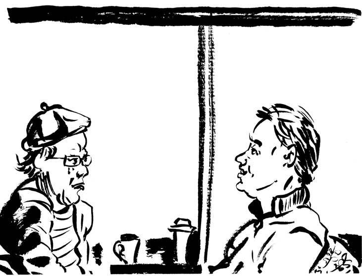
Here is a new series of drawings I've been working on. In it, I want to explore the place and function of traditional drawing in our brave new world of technology. Of course, a large number of people, from the general public to professional art directors and gallery owners, etc, still love the look and feel, as well as the artistic possibilities presented by, hand-made representational drawings. This series of drawings on art and technology grew from my thoughts on this subject, along with the fact that, like many people, I am constantly surrounded by high tech gadgets. I love the ease of use and new possibilities for expression afforded to be by my iPhone, Macbook Pro and Wacom Cintiq tablet. For those who follow me on twitter, you know I like to occasionally post about high tech news alongside news from the art and illustration worlds. I especially like to read about Apple, a company that in my opinion has captured the public's imagination and is innovating and changing our world significantly. So perhaps it was inevitable that one day I would turn to the pieces of high tech all around me... and start drawing them.

I like these drawings because they do a number of things: on the one hand, they acknowledge my own struggles as an artist who does so-called "traditional" drawing. It can be difficult to get this type of art noticed and taken seriously, despite people in general "liking" the look and feel of hand-drawn work. The other thing this series does is nicely problematizes traditional drawing in the context of our fast-paced high-tech world. For one thing, despite all appearances these are not actually hand-made drawings using pen and ink, but rather 100% digital, made using Corel Painter software on my Wacom Cintiq 21UX tablet. When printed on fine art paper, however, they look like pen and ink drawings or etchings. What does the exclusive use of digital technology to create the drawings say about the way art can be mediated by technology in today's world? Also, the subject matter of these drawings is clearly technology itself (or, more precisely, technological products) but the approach is 500 years old (that of the European still-life). These drawings take a traditional still-life approach to objects such as the iPhone, an object of amazing complexity and design. Apart from challenging the traditional notion of a representational still life (can an iPhone or a mouse have the same silent beauty and provide the same scope for reflection as a landscape or an artfully arranged bouquet?), they also kick up a lot of interesting formal questions. For instance, how do you represent the luminous iPhone screen using black and white lines? (Personally, I think I still need to work on this... maybe I'll do a whole series of iPhones or computer screens to try and push this even further because it really is one of the things that fascinates me most about drawing technology).

Apart from all these considerations, I also hope to draw attention to the beauty of the high tech gadgets we keep around us. When's the last time you really admired the slightly recessed key of an aluminum 2008 Macbook Pro, or the patient curvature of a black computer mouse? I hope these drawings invite this kind of contemplation and admiration of the amazing technology that surrounds us. I hope you like this series. More to come next year!

Friday, November 11, 2011

Remembrance Day Illustration


Today is Remembrance Day in Canada (Veteran's Day in the US), and so a fitting day to post an illustration I made for the Literary Review of Canada's upcoming November issue. I call it "The Burden of the War in Afghanistan." It accompanies an article about the social, economic, and psychological effects of Post-Traumatic Stress Disorder in Canadian Soldiers returning from the Afghan war. War is a hellish thing, and its long-term effects haunt generations of soldiers and their families. I post this out of gratitude to veterans in every country who served in wars around the world, many of whom gave the ultimate sacrifice, and to those currently serving in wars today, all of whom have suffered and continue to suffer under the inhuman burden of living through that much violence.

Friday, October 28, 2011

Kannagi in the Royal Court

(Detail 1)
(Detail 2)

My new piece "Kannagi at the Royal Court" has just been selected to be part of the "I Have the Right" exhibit on art & human rights sponsored by the PICTURE Art Foundation (http://www.pictureartfoundation.org/). Thank you PICTURE Art Foundation, and congratulations to all the artists who participated!

Where did the idea of "human rights" come from? We often assume it originated in 1948 with the Universal Declaration of Human Rights by the United Nations. Most people would be hard-pressed to come up with other sources for the idea of "human rights," perhaps (in a pinch) citing some texts from the 18th century European Enlightenment. In any case, most people pretty much equate the rise of "human rights" with the rise of modern Western democracies. However, it is a mistake to think that only modern (or Western) societies have exhibited a concern for "human rights." In fact, there is increasing evidence to show that pre-modern, non-Western cultures all over the world have supported ideas of "human rights" for centuries, mostly through story-telling. Also, most of the political and social ideas of these cultures were rooted in religions. Therefore, it's fair to say that many pre-modern, non-Western religions have also advanced (or at least supported) ideas of "human rights." One such example from India is the story of Kannagi from the Tamil epic Cilappatikaram ("The Tale of the Anklet," circa 2nd century CE).

Thursday, October 6, 2011

R.I.P. Steve Jobs (1955-2011)


Very busy day today... but I had to pay tribute to a great innovator and creative genius. This took about 1/2 hr on my trusty Macbook Pro.

R.I.P. Steve Jobs.

Friday, September 30, 2011

Tom's Fairy Tales #3: The Elephant and the Sparrow

(Click to Enlarge)
So for my third instalment in my Fairy Tales series, I've gone way back to what many consider the oldest collection of fairy tales in the world. I've chosen a story from the Panchatantra, a medieval Indian collection of mostly animal stories in Sanskrit. It is one of the oldest works of literature in the world.

In this Sanskrit tale from the Panchatantra called "The Duel Between Elephant and Sparrow," a woodpecker and a sparrow, with the help of their friends, a tiny gnat and a frog, take revenge on a huge elephant, who in a fit of spring fever destroyed the sparrow's nest and crushed her eggs. The four friends devise the following plan to kill the elephant: first, the tiny gnat buzzes in the elephant's ear, so that he shuts his eyes in delight at the sweet sound. At that point, the woodpecker swoops in and pecks out the elephant's eyes, leaving him to stumble to where the frog croaks by the edge of a deep pit (sometimes a bog of quicksand, depending on the version of the story). Thinking that water is near, the elephant goes to where the croaking sound is and falls in the pit to his death. In my picture, the little gnat has just started buzzing and the elephant is lulled into a pleasant state, his eyes fluttering. The woodpecker is taking off to peck out his eyes and the sparrow watches attentively on a leaf…

Thursday, September 15, 2011

Tom's Fairy Tales #2: Rumpelstiltskin


The final scene of the story:

"... Could your name be Rumpelstiltskin?," asked the Queen.

"The devil told you that!" shouted the little man [and] he ran away angrily, and never came back.

(from the 1812 version of the fairy tale by the Brothers Grimm)

Wednesday, September 7, 2011

Tom's Fairy Tales #1: Ogre (From Three Billy Goats Gruff)


(Detail 1)

(Detail 2)


I've decided to start a small series of drawings based on timeless fairy tales. This is a drawing from the Norwegian story of the Three Billy Goats Gruff... There's the first goat, yearning for greener pastures, about to cross over the dreaded bridge under which the Ogre resides... Will he make it??

Painter 11 & Wacom Cintiq.

"Awakening:" Cover for Oxford University Press


Well here at long last is my digital painting for Oxford University Press, called "Awakening." It will be the cover image for Sovereignty's Promise: The State as Fiduciary by Evan Fox-Decent, Professor of Law at McGill University. Once the book is released, I will post the actual cover once the fine designers at OUP are done putting my painting into it...

In the book, Fox-Decent re-imagines Thomas Hobbes for the 21st century. The painting shows a multicultural mosaic of people making up the State, which is personified as an androgynous figure. The central idea of the book is reflected in the way the people in the painting are crowned while the State is not crowned. The people have the power.

For those political philosophy majors out there, you might notice that my painting resembles the engraving on the Penguin Classics edition of Leviathan. That cover, which can be seen here, shows Leviathan (the representation of the State) with a crown, and the people as his loyal subjects. This relationship is turned on its head in Fox-Decent's book. The people now hold the power and the State has a fiduciary responsibility to them.

Tuesday, August 16, 2011

Clouds

(Click for larger size)

(Click for larger size)

From the piece I'm currently working on ... (will post the final piece in its entirety soon). Corel Painter XI & Wacom Cintiq

Saturday, August 6, 2011

Letter Writing

(Click to enlarge)

Corel Painter 11 & Wacom Cintiq 21 UX

Sunday, July 31, 2011

Multicultural Mosaic of People

(Click to enlarge)

(Detail - click to enlarge)


I've been working on a few projects over the past few weeks, including one that involves showing a multicultural mosaic of people seen from the back. These are details from that painting, still a work in progress. The tools I'm using are Corel Painter 11 and the Wacom Cintiq 21UX.

Even though I've written about this before on this blog, I have to say it again: I just love the way Painter lets you leave evidence of the "artist's hand." This is (ahem) hands-down one of my favourite things about Painter: the way you can see each stroke, and the way strokes interact in natural-looking ways without losing their individual qualities. You can also adjust each stroke so it has very specific properties before laying it down. In practice, this provides a lot of opportunities to DRAW within paintings... to distribute pigment using lines and also to create crumbly textures. In this image, there's a lot of brushwork using the Oils Smeary Round brush as well as some Sponge to get nice textured splotches... and I used dark blue to give the whole thing a bit of a woodcut feel.

I enjoy drawing or painting for articles/books that promote multiculturalism and tackle issues of identity. Here are some more drawings along these lines, done for the LRC (Literary Review of Canada).

Sunday, June 26, 2011

"People in Cafes" Featured on Glossom.com

Hey this is cool! The curators at Glossom.com, a networking site for artists based out of Milan, Italy, chose my collection "People in Cafes" as one of the Collections to be featured on their homepage and on their blog. They're also promoting my drawings via Facebook, Tumblr and Twitter.

Glossom lets you create collections of your work which, unlike on Flickr, can be artfully arranged, each thumbnail re-sized and cropped, so that the Collection itself becomes a work of art. You also choose a cover image for the collection that conveys the overall mood. It's a great promotional tool.

Thanks Glossom !

Saturday, June 25, 2011

Friday, June 24, 2011

Friday, June 3, 2011

New Sketches from Ottawa!


Well my life has become very busy lately, but I'm finally back with some new posts... Now that the summer weather has finally come to Canada, I find myself sitting in the beautiful sun with my sketchbook and brush pen more often. Please check out my Flickr site (link in the sidebar) to see all my latest sketches. Ha ha Ottawa is so LEAFY - there's so much nature depicted in these drawings that they hardly look like "urban" sketches but they are!

Wednesday, May 11, 2011

New Urban Sketches on my Flickr Sketchblog


Just posted new urban sketches from Ottawa on my Flickr urban sketch blog. Click here to see all of them (or click the Flickr link in the menu on the right)

Wednesday, May 4, 2011

Don Draper (Jon Hamm)


I think Mad Men, Matthew Weiner's series about hard-drinking, fast-living advertising execs in '60s Manhattan, is hands-down the best show on TV right now. 

This portrait of Don Draper (brilliantly played by Jon Hamm) was a blast to draw. It was fun trying to capture the classic Hollywood handsomeness of Don/Jon without resorting to generic stereotypes (i.e., comic book shorthand). By the way, in case you haven't heard Mad Men has been renewed for three more seasons! This calls for a celebration - triple martini lunch anyone?

(Ps: check out this article about the real-life Don Draper - below. Really fascinating!)


Thursday, April 14, 2011

Stephen Harper


Finished the Stephen Harper caricature today! Thanks to everyone who emailed me and contacted me via twitter with great suggestions for what to put on baby Harper's bottle! I just love the winning entry :)  I wonder whether Canadians can stomach another term of Baby Harper's Republican-Enriched Milk diet ?? We'll find out on May 2nd (that's federal election day in Canada for those who don't know) ...

Saturday, April 9, 2011

What Is Baby Harper Drinking?


Here's a little cartoon of Stephen Harper, our current PM, not finished yet, but I've posted a few early stages just for fun. I've been thinking about what to put on the bottle. Any suggestions? Get creative and send me your best idea (comment or email, or contact me on twitter)!

It's so much fun making political caricatures :) By the way, for those digital painters out there I tried a new brush for this piece: the "Smeary Flat" brush under the "Oils" menu in Painter along with a "Smudge" blender. Nice blending results although not as distinctive as the Real Bristle brushes... Much nicer tilt control on this brush however.

Friday, April 1, 2011

Velazquez Jesus

This is my 3rd painting with the Cintiq 21 UX and Corel Painter - an image of Jesus from a Velazquez painting. Very loose and sketchy... I started this with the intention of turning it into a more finished painting but then had to go away for the weekend. I came back and thought "you know, it's interesting as is!" It betrays my comic book influences, and I like that. All the scraggly patches of brown-green in the hair was meant as an underpainting... more refined versions of the image would have included drawing tweaks (the hair needs tweaking, especially in the top left where it meets the crown of thorns at an angle that doesn't quite match up with where the hair starts falling from beneath the crown).

Second Cintiq Painting ... Learning Much

I'm loving my Cintiq 21 UX!! Got it 2 weeks ago, made a few sketchy paintings since then just to get a feel for it along with Corel Painter 11... amazing program. So this is my second "oil" sketch done with the Cintiq. It's a detail from Caravaggio's "Calling of St Matthew." I decided to start using Painter and the Cintiq to copy these great Renaissance/Baroque paintings because I love the old masters. I love looking at the way they depict faces especially. I've always enjoyed drawing people's faces because of the way faces tell stories and offer us a glimpse into people's psychology. That's why my favourite illustration contracts are the ones where I get to draw or paint portraits and caricatures of political and literary celebrities (see my website under the "portraits" link for some examples).

The whole sketch took me about 4 hours from start to finish. I found it a real challenge to depict the subtle light variations that Caravaggio's art is known for. I think this is because I'm still such a novice with Painter. Overall, I avoided using the opacity sliders and just tried to lay down thin glazes of oil colour (I did this through adjusting the pressure of my stroke with the Wacom pen) and mix them naturally using the Mixer palette. The whole piece is done on one layer. For now, I prefer keeping things on one layer because it duplicates the feel of a traditional painting on canvas. You could say that at this early stage I'm trying to forget I'm on a tablet and just paint as if I would on a canvas. Oh, and the brush work is not nearly as blendy as Caravaggio's original with all those thin glazes of oil. I was just discovering the Real Bristle Brushes and restricted my use to the Real Flat, Real Oils Short, and especially the Real Flat Opaque brush. I also used a Fan brush for some blending, and the Real Blenders. Overall, I learned a lot with this painting (I learned what the Mixer palette was, for instance, and about a few more brushes); however, in the future I am going to try to create smoother gradations. If that means resorting to opacity sliders, I'll give it a try.

If anybody out there has any great tips on how to Blend in Painter, let me know! I'd love to hear from you!

First Painting with the Cintiq


Ok so here's my first painting with the Cintiq. I love Renaissance art so I chose an Andrea del Sarto painting ("Portrait of a Man") from a colour brochure I had in my library. I'm a total newbie with Corel Painter 11... but I just plunged right in, starting things off with an underdrawing in brown chalk (see above). I then basically experimented with the Artist's Oils and Real Bristle brushes... I don't exactly remember all the ones I used but definitely the Real Flat Opaque and some Blender brushes). I mixed the colours directly in the painting without using the Mixer palette. Don't you just love those realistic-looking blobs of oil paint in the bottom image?? :)

Dreaming

More fun with the Cintiq 21 UX and Painter. This is a quick drawing I made using my favourite brush of all for drawing in Painter: the "Dry Ink" brush in the "Calligraphy" brush category. This brush is my new best friend :) When I found it I started smiling right away (hint: when starting out with Painter just go crazy trying out all the different brushes - it's a blast!). These are EXACTLY the types of scraggly lines that I love to do. So much character in these types of lines... Also, this brush is relatively close in look and feel to the Pentel brush pen, which I use for all my urban sketches, which you can see on my twitter page. The variability of width is there, just like with a real brush pen, although the dry ink brush in Painter is a lot rougher and scragglier. I love this brush. And as you can see, you aren't limited to just using black either. All the colour in this drawing is laid down using various sizes of dry ink brush.


After it was done I threw on a thick canvas-like texture using the "Add Grain" brush in Painter's "Photo" brush category. This just lays the grain straight over whatever you've done. Neat effect.

Trying Out Different Brushes

An improvisation done in Painter on the Cintiq, testing out as many different brushes as possible ... took about 5 minutes. With the Cintiq and Painter, I'm loving my life right now! So many years of traditional drawing and I've finally found a way to make a seamless leap into drawing and painting on a screen that feels intuitive. Great feeling.